
Luxury Hangar Home Interior Design: Why 2026 Is the Year of Saturation, Florals, and Fearless Color
Luxury design had a long, serious relationship with beige.
It was safe.
It was clean.
And if we’re honest it became predictable.
But after walking the floor at KBIS 2026 the global home industry show one thing became impossible to ignore for luxury hangar home interior design:
Color is back. And not timidly.
From booth to booth, especially among major design brands, there was one undeniable pattern: saturation. Confident, intentional color. Not chaotic. Not loud for attention. Grounded. Rich. Deliberate.
For those who believe a home should be both precise and personal, this shift feels less like a trend and more like permission.
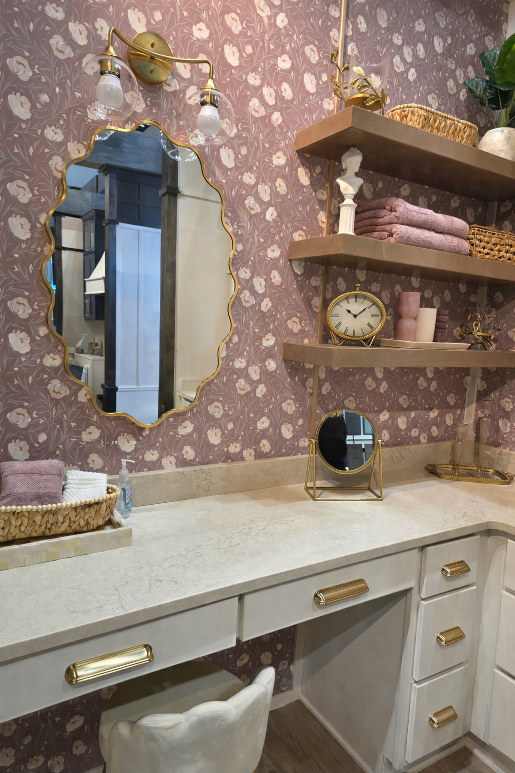
Mineral Pink and Brass: A Powerful Saturated Palette for 2026
Let’s address the most talked-about shift.
Pink.
Not pastel nursery pink.
Not bubblegum.
Not trend-chasing blush.
This was mineral pink. Clay pink. Rosewood. Deep berry undertones layered into architectural settings.
This saturated pink appeared across appliances, cabinetry, tile, and installation walls. When a color shows up consistently across major design brands, that’s not coincidence it’s directional.
Here’s what makes this a true luxury strategy in 2026:
It’s grounded.
Paired with natural stone
Balanced with brass and matte black
Anchored by wood grain
Offset by charcoal or navy
In large-scale aviation residences where steel, concrete, and expansive volumes dominate warmth matters. Saturation softens structure. It prevents cavernous interiors from feeling cold or overly industrial.
Pink isn't a shock value.
It’s architectural grounding.
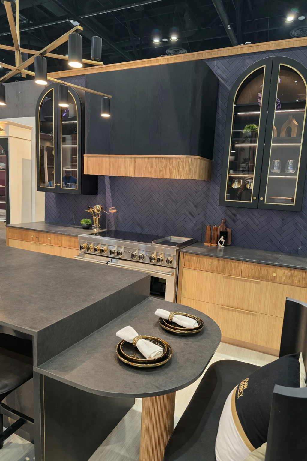
2026 Kitchen Design Trends: Teal Appliance Columns & the End of Camouflage
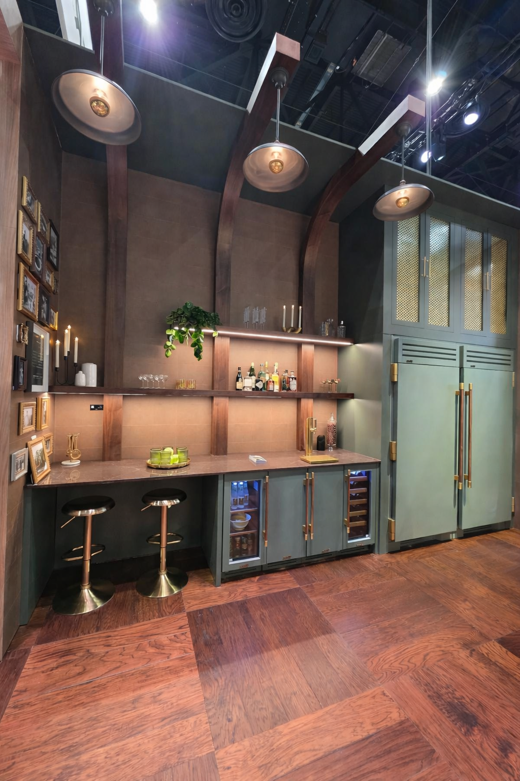
I have to admit something.
I secretly loved the teal True appliance columns.
For years, high-end appliances were designed to disappear panel-ready, hidden, visually quiet.
Now they’re being framed as architectural features.
We saw:
Teal refrigeration columns
Deep navy ranges
Olive-toned accents
Appliances are becoming intentional focal points. And when executed well, they elevate the entire kitchen.
This isn’t maximalism for chaos.
It’s design confidence.
In aviation homes where kitchens often open into expansive entertaining zones or overlook hangar spaces color helps establish hierarchy. It grounds the eye in open volumes.
Instead of hiding the heart of the home, 2026 design is highlighting it.
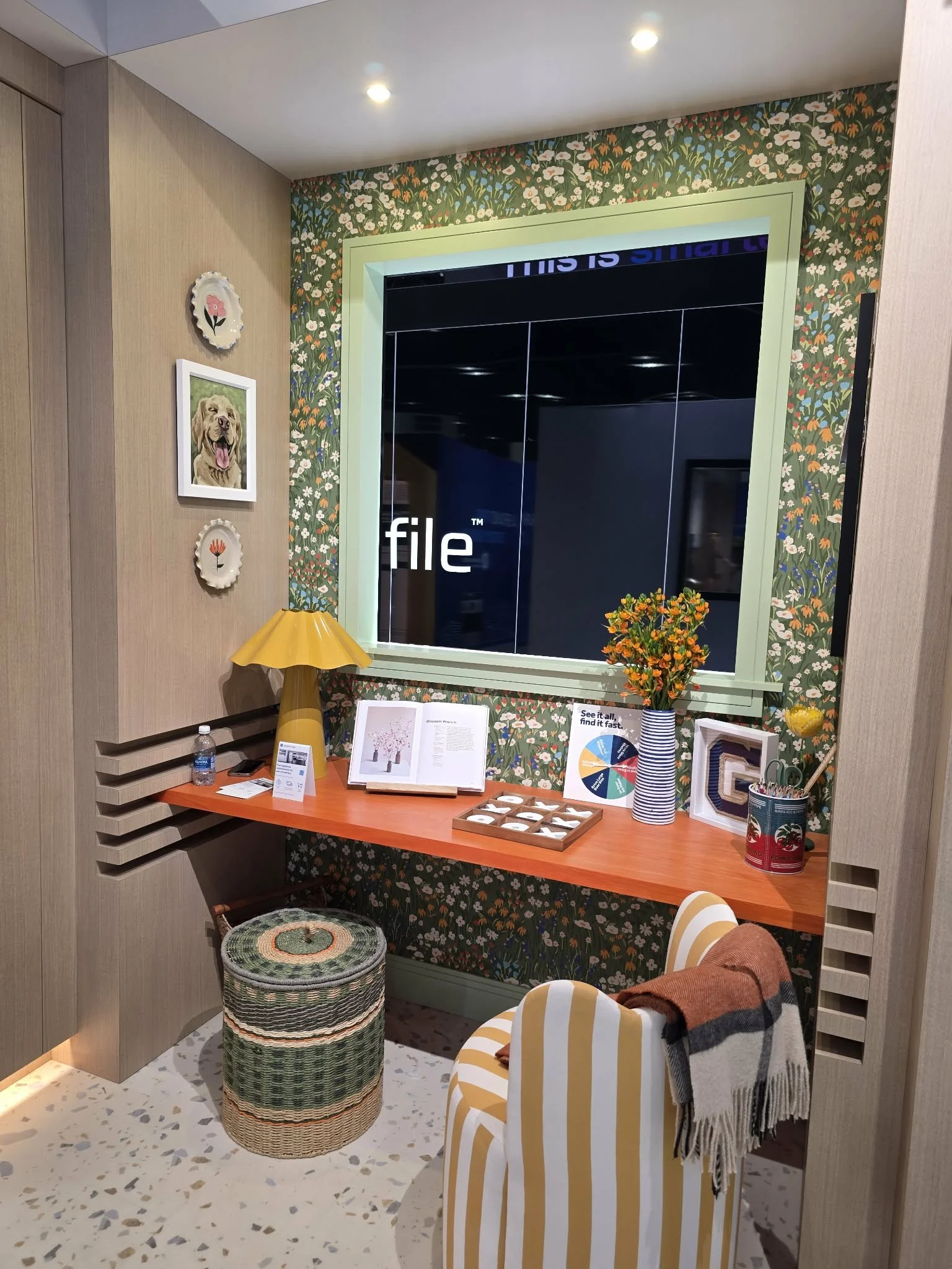
Modern Florals in Architectural Spaces: Texture That Grew Up
Make it stand out
Whatever it is, the way you tell your story online can make all the difference.
Yes, florals were everywhere.
But not in a cottagecore way.
These were sculptural botanicals. Oversized wallpaper installations. Floral tile integrated into spa showers. Wildflower textures layered into otherwise contemporary environments.
Modern florals are being used strategically especially in secondary or personal zones.
Think:
Powder baths
Dressing rooms
Private lounges
Spa-style primary suites
They create intimacy within large architecture. They soften structure without diminishing strength.
They are not “girly.”
They are curated.
And in many hangar homes, there’s an opportunity to carve out a personal retreat, a wife's lounge, a private bath, a layered dressing space that balances the structured precision of aviation living.
Florals can provide that contrast beautifully.
Strategic Saturation in Large-Scale Hangar Architecture
This is where color moves from trend to strategy.
Large-scale hangar homes require grounding.
Expansive ceilings.
Steel framing.
Aircraft views.
Industrial doors.
Without intentional layering, these environments can feel visually and acoustically harsh.
Saturation helps:
Anchor the eye in open volumes
Add psychological warmth to industrial materials
Layer dimension into open-concept plans
Create zoning without adding walls
Color, when done correctly, becomes architectural not decorative.
The difference between bold and costly almost always comes down to when color decisions are made in the design process.
In aviation residences, where structure and lifestyle intersect, those decisions must happen early.
Fearless Doesn’t Mean Reckless
Just because color is back doesn’t mean everything should be bold.
Luxury in 2026 is not loud.
It’s intentional.
The most refined installations at KBIS paired saturation with restraint:
Rich teal + warm wood
Clay pink + honed stone
Deep berry + brushed brass
Florals balanced by clean-lined cabinetry
This isn’t about throwing paint at a wall.
It’s about designing emotion into the blueprint.
Why This Shift Feels Natural for Aviation Clients
Aviation professionals understand something deeply:
Precision matters.
But so does passion.
The hangar is structured, mechanical, and performance-driven.
The home attached to it should feel alive.
Color bridges that gap.
It softens steel.
Warms volume.
Personalizes scale.
Signals confidence.
After years of safe minimalism, it feels refreshing to see luxury embrace personality again without sacrificing discipline.
Luxury Is Confident Again
Luxury isn’t getting louder.
It’s getting braver.
It’s no longer afraid of saturation, florals, or statement appliances. And when applied strategically especially in hangar homes and aviation residences these shifts don’t feel trendy.
They feel timeless.
Because timeless design isn’t about avoiding personality.
It’s about executing it with intention.
Ready to Design Boldly and Strategically?
If you’re planning a hangar home or aviation residence in the next 12–24 months, color decisions should be made early not after architecture is locked in.
Saturation requires intention.
Florals require placement.
Appliance statements require layout coordination.
When done strategically, bold becomes beautiful.
If you’re ready to design a home that reflects both precision and personality:
→ Contact Aeroview Design Co. to begin the conversation.
Because in 2026, luxury isn’t beige.
It’s confident.